 |
| Advertising & Campaigns - Olympics Poster - London 2012 |
Wednesday, 23 January 2013
Advertising & Campaigns - Olympics Poster - London 2012
Monday, 14 January 2013
Postcard Campaign - Binge Drinking
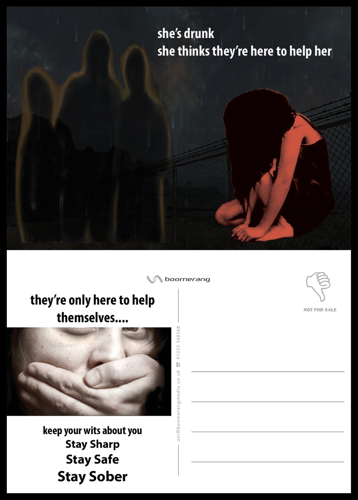
This project which focuses on attempts to make people, young people in particular, aware of the dangers of binge drinking immediately made me think of the threats to young women and men on the streets at night when everyone pours out of nightclubs. It reminded me of a friend telling me about a young woman she saw lying on the street one night, comatose with drink, wearing one shoe.
There's no point telling young people that their livers might give up in their fifties. Young people mostly think you should be dead in your fifties anyway....or making drink more expensive. They'll always find a way to get it. But the prospect of being seriously harmed might make an impact. Here, a young girl, helpless after a night's drinking sees three young guys who, in her innocence, she hopes might help her get home. They see a vulnerable young woman out of control and have other things on their mind. The theme could easily be reversed to depict a vulnerable young man.
I used Photoshop CS6 for this project, using four different images. I used various selection tools, masks, blends and Refine Edge to put them all together to create the final image.
Tuesday, 11 December 2012
Summary of Term 1
This course has been so interesting, relevant and practical. Interesting in the topics covered each week and practical given the need to immediately find the skills to complete the projects. If you don't have the skills, you're forced to go and learn them and that impacts on not just the Graphic Design area but on CM2 overall.
The course is relevant and practical in the sense of preparation for actually working in this area in the real world. The Professional Portfolio and Online Branding part of the course makes us organise our work so that it's all together in one place. That gives inspiration to do better the next time so that the portolio is as good as it can be. I find that I look at the work from the point of view of a potential employer rather than just from my point of view. The whole approach of selling ourselves and our skills online really concentrates the mind.
The course is relevant and practical in the sense of preparation for actually working in this area in the real world. The Professional Portfolio and Online Branding part of the course makes us organise our work so that it's all together in one place. That gives inspiration to do better the next time so that the portolio is as good as it can be. I find that I look at the work from the point of view of a potential employer rather than just from my point of view. The whole approach of selling ourselves and our skills online really concentrates the mind.
Sunday, 9 December 2012
Selling Sensitive Product - Poopa Scoopa

If there's one thing dog owners dread, it's the whole routine of disposing of Fido's waste on the daily walk. What they dread more is the ire of the general public if they don't do a proper clean up. And what they probably dread most of all is the prospect of having to do it at all with leftover plastic bags.
I came across this product on the web and thought it seemed like a good idea although I suspect it's probably more trouble than it's worth and doesn't quite measure up to its promise........
Anyway, the design was done between Adobe Illustrator and Photoshop and I decided to use a kind of retro/cartoonish feel, using garish reds on a cream background with the images of the paw and 'waste' and a 'lighthearted font called Hobo. I used Photoshop to remove the background from the 'Scoop' image, then Illustrator using the pen tool to trace the paw and also for the 'waste' - I'd like to improve my turd drawing technique but there are precious few tutorials on the topic on the web. I used the 3D - Extrude & Bevel effect on the paw, Type on a Path tool for the text around the paw and Symbols for the clouds and the grass. My favourite part of all is the title - Poop Happens - a cleaned up version of the real thing.
Smirnoff Ad Campaign - Travel theme
.png)


The project is based loosely on the Travel theme using the Smirnoff campaign's clever idea of seeing something unexpected through the bottle. The top image showing a setting sun landscape and spying a UFO landing through the bottle. The middle image juxtaposes flood with drought while the bottom one shows an idyllic Irish scene of a thatched cottage by the ocean contrasted with a metropolitan city view.
Corporate Identity 2 - Playwell - Quality Toys

Once again the keyword in the brief is 'Quality'. To some, that means toughness and the ability to not fall apart through use. To others, it harks back to more traditional toys which usually appeal to a certain kind of adult rather than a child! With nostalgia being such a powerful influence in advertising at present, I thought of those wooden boxes of bricks from long ago, made from wood and in primary colours and shapes. The different brick shapes would fit snugly into the box if fitted back carefully like a jigsaw so that the sliding wooden lid would close smoothly. That was my inspiration for this project. The three primary shapes in primary colours. The text uses the Stencil font which also reflects old fashioned toys with the 'A' in PLAYWELL replaced by another primary shape in a primary colour..
The design was done in Illustrator drawing the simple shapes and using the built in 'kids' colour swatches. I then used the 3D - Extrude & Bevel effect on the shapes.
Mobile Phone Live Project


I love simple, classic design using lines, squares and colour. This colour combination is from Adobe Kuler and is coincidentally called 'Cell Phone'. I've included three variations of the design but the possibilities are endless, especially when using Kuler.
The design was done in Adobe Illustrator CS6 using the provided template and the rectangular grid tool.
Subscribe to:
Comments (Atom)